
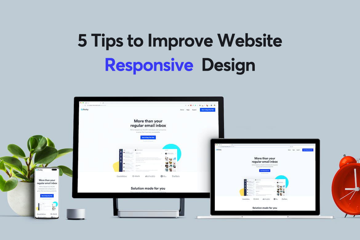
Responsive web design is crucial in today’s digital landscape where users access websites on a variety of devices, from smartphones to desktop computers. Ensuring that your website looks and functions well across all screen sizes is essential for providing a seamless user experience. So, what is the best way to achieve responsive web design?
One of the most effective approaches to responsive web design is using CSS media queries. Media queries allow you to apply different styles based on the characteristics of the device or browser viewing your website. By defining breakpoints at which your layout should change, you can create a design that adapts fluidly to different screen sizes.
For example, you can set a media query to adjust the layout when the screen width reaches a certain size, such as 768 pixels for tablets or 320 pixels for smartphones. Within these media queries, you can modify elements like font sizes, spacing, and even hide or show certain content to optimize the user experience on each device.
Another important aspect of responsive web design is using flexible grids and images. Instead of setting fixed widths for elements on your website, consider using percentage-based widths or viewport units like vw and vh. This allows your layout to scale proportionally based on the size of the viewport, ensuring that content remains readable and visually appealing on any device.
In addition to CSS techniques, incorporating meta viewport tags in your HTML code is essential for responsive web design. The viewport meta tag tells the browser how to control the page’s dimensions and scaling based on the device’s screen size. By setting initial-scale=1 and width=device-width in your viewport meta tag, you can ensure that your website displays properly across various devices.
Overall, the best way for responsive web design involves a combination of CSS media queries, flexible grids and images, and viewport meta tags. By implementing these techniques effectively, you can create a website that provides an optimal user experience regardless of the device being used. Remember that responsiveness is not just about aesthetics but also about usability and accessibility for all users.
Top 6 Tips for Effective Responsive Web Design
- Use a mobile-first approach when designing your website.
- Prioritize content and features based on their importance for mobile users.
- Utilize CSS media queries to create responsive layouts for different screen sizes.
- Optimize images and videos for faster loading times on mobile devices.
- Test your website on various devices and browsers to ensure consistent user experience.
- Consider using frameworks like Bootstrap or Foundation to expedite the responsive design process.
Use a mobile-first approach when designing your website.
When aiming for responsive web design, it is highly recommended to adopt a mobile-first approach in your website design process. By starting with the smallest screen size and then progressively enhancing the layout for larger devices, you ensure that your website is optimized for mobile users first and foremost. This strategy encourages a focus on essential content and functionality, leading to a more streamlined and user-friendly experience across all devices. Implementing a mobile-first approach not only improves performance but also helps prioritize key elements that are crucial for engaging mobile users effectively.
Prioritize content and features based on their importance for mobile users.
When implementing responsive web design, it is crucial to prioritize content and features based on their importance for mobile users. Mobile users often have different needs and behaviors compared to desktop users, so identifying key content and features that are essential for a seamless mobile experience is vital. By focusing on delivering the most critical information and functionalities upfront for mobile users, you can ensure that your website remains user-friendly and accessible across all devices. This approach not only enhances the user experience but also improves the overall performance and usability of your website on mobile devices.
Utilize CSS media queries to create responsive layouts for different screen sizes.
Utilizing CSS media queries is a key tip for achieving responsive web design by creating layouts that adapt seamlessly to different screen sizes. By defining breakpoints and applying specific styles within media queries, you can ensure that your website looks and functions well on a variety of devices, from mobile phones to desktop computers. This approach allows you to tailor the design of your website based on the viewing environment, providing users with an optimal experience no matter how they access your site.
Optimize images and videos for faster loading times on mobile devices.
Optimizing images and videos is a crucial tip for achieving responsive web design, especially when it comes to ensuring faster loading times on mobile devices. By reducing the file size of media assets without compromising quality, you can significantly improve the performance of your website on smartphones and tablets. Implementing techniques like image compression, lazy loading, and using the correct file formats can help minimize load times and enhance the overall user experience on mobile devices. Prioritizing optimization of images and videos is key to creating a responsive design that not only looks great but also functions seamlessly across different screen sizes and resolutions.
Test your website on various devices and browsers to ensure consistent user experience.
Testing your website on various devices and browsers is a crucial step in achieving the best responsive web design. By checking how your site performs across different platforms, screen sizes, and browsers, you can ensure a consistent user experience for all visitors. Identifying and addressing any issues that arise during testing will help you fine-tune your design and optimize usability, ultimately leading to a more seamless and enjoyable browsing experience for your audience.
Consider using frameworks like Bootstrap or Foundation to expedite the responsive design process.
Consider using frameworks like Bootstrap or Foundation to expedite the responsive design process. These frameworks provide pre-built components, grids, and styles that are optimized for responsiveness, making it easier to create a consistent and user-friendly layout across different devices. By leveraging the power of these frameworks, web designers can save time and effort in coding responsive designs from scratch, allowing them to focus on customizing and refining the overall user experience of their websites.