
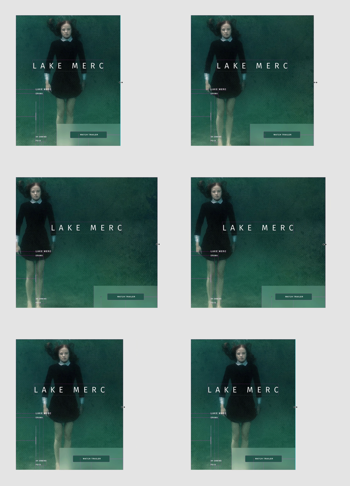
Adobe XD is a powerful tool that has revolutionized the way designers approach responsive web design. With its intuitive interface and robust features, Adobe XD makes it easier than ever to create websites that look great on any device.
One of the key features of Adobe XD is its responsive resize functionality. This feature allows designers to easily adjust the layout of their designs to fit different screen sizes without having to manually resize each element. By simply selecting the elements you want to resize and dragging the handles, Adobe XD will automatically adjust the layout to maintain consistency across different screen sizes.
Another useful feature of Adobe XD is its auto-animate feature, which allows designers to create interactive prototypes with smooth transitions between different artboards. This makes it easy to showcase how a website will look and function across different devices, helping clients and stakeholders better understand the design.
Adobe XD also offers a variety of plugins that extend its functionality even further. From design systems and icon libraries to user flow diagrams and code snippets, these plugins make it easy for designers to streamline their workflow and create more efficient designs.
Overall, Adobe XD is a versatile tool that empowers designers to create responsive web designs that not only look great but also function seamlessly across different devices. Whether you’re a seasoned designer or just starting out, Adobe XD is a valuable tool that can help take your web design projects to the next level.
Top 7 FAQs About Using Adobe XD for Responsive Web Design
- What is Adobe XD?
- How does Adobe XD help with responsive web design?
- What are the key features of Adobe XD for creating responsive designs?
- Can Adobe XD automatically adjust layouts for different screen sizes?
- Does Adobe XD support interactive prototyping for responsive web design?
- Are there any plugins available in Adobe XD to enhance responsive web design projects?
- Is Adobe XD suitable for both beginner and experienced designers working on responsive web design?
What is Adobe XD?
Adobe XD, short for Adobe Experience Design, is a powerful design tool created by Adobe that is specifically tailored for user experience (UX) and user interface (UI) design. It allows designers to create interactive prototypes, wireframes, and mockups for websites and mobile apps with ease. Adobe XD’s intuitive interface and robust features make it a popular choice among designers looking to streamline their workflow and create responsive web designs that look great on any device. With features like responsive resize, auto-animate, and a wide range of plugins, Adobe XD empowers designers to bring their creative vision to life and deliver engaging user experiences across different platforms.
How does Adobe XD help with responsive web design?
Adobe XD simplifies responsive web design by offering features like responsive resize and auto-animate. With responsive resize, designers can easily adjust the layout of their designs to fit different screen sizes without the need for manual resizing. This feature ensures that the design remains consistent and visually appealing across various devices. Additionally, the auto-animate feature allows designers to create interactive prototypes with smooth transitions between different artboards, making it easier to showcase how a website will look and function responsively. Overall, Adobe XD’s intuitive interface and powerful tools make it a valuable asset for designers looking to create responsive web designs efficiently and effectively.
What are the key features of Adobe XD for creating responsive designs?
Adobe XD offers a range of key features that make creating responsive web designs a breeze. One standout feature is the responsive resize functionality, which allows designers to easily adjust the layout of their designs to fit different screen sizes with just a few clicks. Additionally, Adobe XD’s auto-animate feature enables designers to create interactive prototypes with smooth transitions between artboards, making it easy to showcase how a design will adapt across various devices. The availability of plugins further enhances the tool’s capabilities, providing access to design systems, icon libraries, user flow diagrams, and more to streamline the design process. Overall, Adobe XD’s combination of responsive design tools and intuitive features makes it a top choice for designers looking to create visually appealing and functional websites that work seamlessly across different screen sizes.
Can Adobe XD automatically adjust layouts for different screen sizes?
Yes, Adobe XD offers a responsive resize feature that allows designers to easily adjust layouts for different screen sizes. By selecting the elements they want to resize and dragging the handles, Adobe XD automatically adjusts the layout to maintain consistency across various screen sizes. This functionality streamlines the design process and ensures that websites created in Adobe XD look great on any device, making it a valuable tool for creating responsive web designs.
Does Adobe XD support interactive prototyping for responsive web design?
Yes, Adobe XD does support interactive prototyping for responsive web design. With features like auto-animate and responsive resize, designers can easily create interactive prototypes that showcase how a website will look and function across different devices. By utilizing Adobe XD’s tools and functionality, designers can demonstrate the responsiveness of their designs and provide stakeholders with a clear understanding of how the website will adapt to various screen sizes. Adobe XD’s support for interactive prototyping makes it a valuable tool for creating engaging and user-friendly responsive web designs.
Are there any plugins available in Adobe XD to enhance responsive web design projects?
Yes, there are several plugins available in Adobe XD that can enhance responsive web design projects. Plugins like “Auto Layout” and “Responsify” offer features that help designers create flexible layouts that adapt to different screen sizes. These plugins streamline the process of designing responsive websites by providing tools to easily adjust elements and maintain consistency across various devices. Additionally, plugins such as “Viewport Resizer” and “Artboard Plus” offer functionality to preview designs in different viewports and customize artboards for specific devices, making it easier for designers to ensure their designs look great on all screen sizes. Overall, these plugins can significantly improve the efficiency and effectiveness of creating responsive web designs in Adobe XD.
Is Adobe XD suitable for both beginner and experienced designers working on responsive web design?
Many designers wonder if Adobe XD is suitable for both beginners and experienced professionals working on responsive web design. The answer is a resounding yes! Adobe XD’s user-friendly interface and intuitive features make it accessible for beginners looking to learn the ropes of responsive design. At the same time, its advanced functionalities, such as responsive resize and auto-animate features, cater to the needs of experienced designers who require more robust tools for their projects. Whether you’re just starting out or have years of experience in web design, Adobe XD provides a versatile platform that can accommodate a wide range of skill levels and project requirements in the realm of responsive web design.