
Website Page Layout: A Guide to Creating a User-Friendly Design
When it comes to designing a website, one of the key elements that can make or break the user experience is the page layout. The way content is organized and presented on a webpage plays a crucial role in how visitors interact with your site. A well-thought-out layout not only enhances usability but also helps convey your brand message effectively.
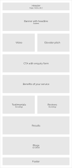
Header Section:
The header section is like the digital front door to your website. It typically includes the logo, navigation menu, and contact information. Placing these elements at the top of the page ensures easy access for users to navigate through your site and find essential information quickly.
Navigation Menu:
A clear and intuitive navigation menu is essential for guiding users to different sections of your website. Use descriptive labels and organize menu items logically to help visitors understand where they are on your site and how to find what they’re looking for.
Content Area:
The content area is where you showcase your main message or offerings. Use headings, subheadings, and paragraphs to structure your content in a readable format. Incorporate images, videos, and other multimedia elements strategically to engage users and break up text-heavy sections.
Sidebar:
Sidebars can be used to display additional information, such as recent posts, social media links, or advertisements. However, be mindful not to clutter the sidebar with too many elements that may distract users from the main content.
Footer Section:
The footer section is often overlooked but serves as a valuable space for including contact details, copyright information, privacy policies, and links to important pages like terms of service or sitemap. It’s also a common placement for social media icons and newsletter sign-up forms.
Responsive Design:
With the increasing use of mobile devices, ensuring that your website layout is responsive is crucial. Responsive design allows your site to adapt seamlessly to various screen sizes, providing users with an optimal viewing experience across devices.
In conclusion, creating an effective website page layout involves thoughtful planning and consideration of user needs. By organizing content strategically, prioritizing ease of navigation, and embracing responsive design principles, you can create a user-friendly website that leaves a positive impression on visitors while effectively communicating your brand message.
Understanding Website Page Layout: Key Questions Answered
- What are the three types of page layout?
- What are the 4 main parts of any website layout?
- How do I make a page layout for my website?
- What is a good page layout?
- What is the layout structure of a website?
- What is the layout of a web page?
- What is the basic format for a web site page?
- What is a website page layout?
What are the three types of page layout?
When it comes to website page layout, there are three primary types commonly used: fixed, fluid, and responsive layouts. A fixed layout has a set width and does not change regardless of the screen size, which can lead to issues on different devices. Fluid layouts, on the other hand, use percentages for widths, allowing elements to adjust based on the screen size. Responsive layouts take fluid design a step further by using media queries to adapt the layout based on the device’s screen size, providing an optimal viewing experience across various devices. Each type of layout has its advantages and considerations, depending on factors such as design flexibility and user experience.
What are the 4 main parts of any website layout?
When considering the key components of a website layout, it is essential to understand the four main parts that form the foundation of a well-structured design. These include the header section, which typically features the logo and navigation menu, guiding users to different pages of the site. The content area is where the main message or information is displayed, using headings and multimedia elements to engage visitors. Sidebars offer additional space for supplementary content like recent posts or social media links. Lastly, the footer section provides important details such as contact information, copyright notices, and links to essential pages, completing the overall structure of a comprehensive website layout.
How do I make a page layout for my website?
Designing a page layout for your website involves careful consideration of various elements to ensure a user-friendly and visually appealing design. Start by defining the purpose of the page and identifying key content that needs to be included. Utilize a grid system to organize elements on the page, maintaining consistency and alignment for a cohesive look. Incorporate white space strategically to improve readability and focus attention on important content. Choose fonts, colors, and imagery that reflect your brand identity and enhance the overall aesthetic. Remember to prioritize responsive design to ensure that your layout adapts seamlessly across different devices. By following these guidelines, you can create an effective page layout that engages visitors and effectively communicates your message.
What is a good page layout?
A good page layout is one that effectively organizes content, enhances user experience, and aligns with the overall goals of the website. It should feature a clear hierarchy of information, making it easy for visitors to navigate and find what they are looking for quickly. A visually appealing design, balanced use of white space, and consistent branding elements also contribute to a good page layout. Additionally, a responsive design that adapts seamlessly to different devices ensures that the website remains accessible and user-friendly across various screen sizes. Ultimately, a good page layout strikes a balance between aesthetics and functionality, creating a cohesive and engaging online experience for users.
What is the layout structure of a website?
The layout structure of a website refers to how different elements are arranged on a webpage to create a visually appealing and user-friendly design. Typically, a website layout includes key components such as the header section containing the logo and navigation menu, the content area where main information is displayed, sidebars for additional content or features, and the footer section with contact details and important links. By organizing these elements thoughtfully and using design principles like hierarchy, balance, and spacing, website designers can create an intuitive layout that guides users through the site seamlessly while enhancing overall user experience.
What is the layout of a web page?
The layout of a web page refers to the arrangement of content elements on a webpage, including the placement of text, images, navigation menus, and other design components. A well-designed layout aims to create a visually appealing and user-friendly experience for website visitors. Typically, a web page layout consists of a header section with branding elements and navigation menus, a content area where the main message or information is displayed, a sidebar for supplementary content or features, and a footer section containing contact information and additional links. Adhering to best practices in web design ensures that the layout effectively guides users through the site while maintaining consistency and coherence in visual presentation.
What is the basic format for a web site page?
The basic format for a website page typically includes a header section with the logo and navigation menu, a content area where the main message or offerings are displayed, a sidebar for additional information or features, and a footer section containing contact details and important links. This structured layout ensures that users can easily navigate the site, access key information, and engage with the content effectively. Incorporating responsive design principles is also essential to ensure that the website adapts seamlessly to different devices and screen sizes for an optimal user experience.
What is a website page layout?
A website page layout refers to the arrangement and organization of content, images, and other elements on a webpage. It determines how information is presented to visitors and plays a crucial role in creating a visually appealing and user-friendly experience. A well-designed layout considers factors such as navigation, readability, visual hierarchy, and responsiveness across different devices. By structuring content effectively and guiding users through the page with clear design elements, a website page layout aims to engage visitors, convey information efficiently, and ultimately enhance the overall user experience on the site.