
Responsive Website: The Key to a Seamless User Experience
In today’s digital age, having a responsive website is no longer just an option – it’s a necessity. With the increasing use of mobile devices to access the internet, it is crucial for websites to adapt to different screen sizes and resolutions. A responsive website is designed to automatically adjust its layout and content based on the device being used, providing users with a seamless and optimized browsing experience.
One of the key benefits of a responsive website is improved user experience. By ensuring that your website looks and functions well on all devices, you can keep visitors engaged and encourage them to explore further. A responsive design eliminates the need for users to zoom in or out to view content, making navigation easier and more intuitive.
Moreover, having a responsive website can also boost your search engine rankings. Search engines like Google prioritize mobile-friendly websites in their search results, meaning that a responsive design can help improve your visibility and drive more traffic to your site.
From a business perspective, a responsive website can lead to increased conversions and sales. When users have a positive experience on your site, they are more likely to stay longer, interact with your content, and ultimately make a purchase or inquiry. By catering to the needs of mobile users, you can tap into a larger audience and capitalize on the growing trend of mobile commerce.
In conclusion, investing in a responsive website is essential for staying competitive in today’s digital landscape. By prioritizing user experience, search engine optimization, and conversion rates, you can create a website that not only looks great but also delivers results. Whether you’re launching a new site or revamping an existing one, make sure it is responsive to provide users with the best possible browsing experience across all devices.
Mastering Responsive Web Design: Essential FAQs for Optimal Site Performance
- How do I make my website fully responsive?
- What is meant by responsive website?
- What is an example of a responsive website?
- What do you call a responsive website?
How do I make my website fully responsive?
Making your website fully responsive involves a combination of design principles and technical implementation. To start, you should prioritize a mobile-first approach, where you design and develop your site with mobile devices in mind first, then scale up for larger screens. Utilize flexible grids and layouts that adjust based on screen size, implement media queries to define different styles for various devices, and optimize images and multimedia content for faster loading times. Test your website across different devices and browsers to ensure consistent performance and user experience. Additionally, consider using frameworks like Bootstrap or Foundation that provide responsive design components to streamline the process. By following these steps and staying up-to-date with best practices in responsive web design, you can create a fully responsive website that caters to users on any device.
What is meant by responsive website?
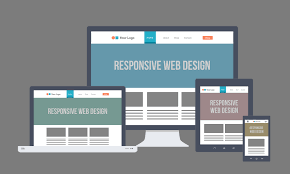
A responsive website refers to a design approach that aims to create a seamless and user-friendly experience across various devices, including desktops, laptops, tablets, and smartphones. In essence, a responsive website automatically adjusts its layout and content based on the screen size and resolution of the device being used. This adaptive design ensures that users can easily navigate and interact with the website without having to zoom in or out or scroll horizontally. By embracing responsiveness, websites can cater to the diverse needs of their audience, providing a consistent and optimized browsing experience regardless of the device being used.
What is an example of a responsive website?
An excellent example of a responsive website is Starbucks.com. When you visit the Starbucks website on different devices, such as a desktop computer, tablet, or smartphone, you will notice how the layout and content adjust seamlessly to fit the screen size. The site maintains its branding and functionality across all devices, providing users with a consistent and user-friendly experience regardless of how they access the site. This showcases the importance of responsive design in ensuring that a website is accessible and engaging for users on various platforms.
What do you call a responsive website?
A responsive website is a website that is designed to adapt and adjust its layout, content, and functionality based on the device and screen size being used to view it. This means that regardless of whether a visitor is accessing the site on a desktop computer, tablet, or smartphone, the website will automatically resize and reformat itself to ensure an optimal viewing experience. By incorporating flexible grids, images, and media queries into its design, a responsive website can provide users with a seamless browsing experience across various devices, without the need for separate mobile versions or excessive zooming and scrolling.