
The Power of CoffeeCup Responsive Site Designer
CoffeeCup Responsive Site Designer is a versatile and powerful tool for creating stunning, mobile-friendly websites with ease. Whether you’re a seasoned web designer or just starting out, this software offers a range of features that make building responsive sites a breeze.
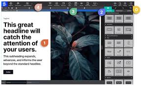
One of the key highlights of CoffeeCup Responsive Site Designer is its intuitive drag-and-drop interface. You can easily create layouts, add elements, and customize styles without any coding knowledge required. This makes it ideal for both beginners and experienced designers looking to streamline their workflow.
With CoffeeCup Responsive Site Designer, you can preview your site in real-time across different devices to ensure it looks great on desktops, tablets, and smartphones. The software automatically generates responsive code, saving you time and effort in optimizing your site for various screen sizes.
In addition to its responsive design capabilities, CoffeeCup Responsive Site Designer offers a wide range of pre-designed templates and customizable themes to help you get started quickly. You can also integrate third-party tools and services seamlessly to enhance the functionality of your website.
Overall, CoffeeCup Responsive Site Designer is a comprehensive solution for creating modern and visually appealing websites that adapt to different devices. Whether you’re building a portfolio, e-commerce site, or blog, this software provides the tools you need to bring your vision to life.
If you’re looking for an efficient and user-friendly way to design responsive websites, consider giving CoffeeCup Responsive Site Designer a try. Its features and flexibility make it a valuable asset for any web designer looking to stay ahead in the ever-evolving digital landscape.
9 Essential Tips for Mastering CoffeeCup Responsive Site Designer
- Use the grid system to easily align and position elements on your website.
- Take advantage of the pre-designed themes and templates for a quick start.
- Customize fonts, colors, and styles to match your brand’s identity.
- Optimize images for faster loading times on different devices.
- Preview your design in various screen sizes to ensure responsiveness.
- Add interactive elements like buttons, forms, and sliders to engage users.
- Test your website regularly on different browsers to ensure compatibility.
- Implement SEO best practices to improve visibility on search engines.
- Regularly update content and design elements to keep your site fresh and engaging.
Use the grid system to easily align and position elements on your website.
Utilize the grid system in CoffeeCup Responsive Site Designer to effortlessly align and position elements on your website. By leveraging the grid system, you can ensure that your design remains consistent and visually appealing across various screen sizes. This feature allows you to create a structured layout that not only enhances the overall look of your site but also improves user experience by providing a seamless navigation flow. Take advantage of the grid system in CoffeeCup Responsive Site Designer to achieve a professional and polished website design effortlessly.
Take advantage of the pre-designed themes and templates for a quick start.
When using CoffeeCup Responsive Site Designer, it is highly recommended to take advantage of the pre-designed themes and templates available. These resources offer a quick and convenient way to kickstart your website design process, saving you time and effort in creating a visually appealing layout. By starting with a pre-designed theme, you can focus on customizing the content and fine-tuning the design elements to suit your brand or style preferences. This feature not only speeds up the development process but also ensures that your website has a professional look right from the start.
Customize fonts, colors, and styles to match your brand’s identity.
In CoffeeCup Responsive Site Designer, you have the flexibility to customize fonts, colors, and styles to perfectly align with your brand’s identity. By selecting fonts that reflect your brand’s personality, choosing colors that resonate with your brand’s aesthetic, and applying styles that convey your brand’s message, you can create a cohesive and visually appealing website that strengthens your brand presence online. Customizing these elements in CoffeeCup Responsive Site Designer allows you to tailor every aspect of your site to match your brand’s identity, ensuring a consistent and memorable user experience for visitors.
Optimize images for faster loading times on different devices.
Optimizing images for faster loading times on different devices is a crucial tip when using CoffeeCup Responsive Site Designer. By reducing the file size of images without compromising quality, you can ensure that your website loads quickly and smoothly on desktops, tablets, and smartphones. This optimization not only improves user experience but also boosts your site’s SEO performance. CoffeeCup Responsive Site Designer provides tools and features to help you easily resize and compress images, allowing you to strike the perfect balance between visual appeal and loading speed across various devices.
Preview your design in various screen sizes to ensure responsiveness.
When using CoffeeCup Responsive Site Designer, it is crucial to preview your design in various screen sizes to ensure responsiveness. By doing so, you can see how your website layout adapts to different devices, such as desktops, tablets, and smartphones. This feature allows you to identify any potential issues and make necessary adjustments to optimize the user experience across all screen sizes. Previewing your design in different screen sizes is an essential step in creating a fully responsive website that looks great and functions seamlessly on any device.
Add interactive elements like buttons, forms, and sliders to engage users.
Enhance user engagement on your website by incorporating interactive elements such as buttons, forms, and sliders using CoffeeCup Responsive Site Designer. By adding these dynamic features, you can create a more immersive and interactive browsing experience for your visitors. Buttons can guide users to specific actions or pages, forms can collect valuable information from them, and sliders can showcase content in a visually appealing way. These elements not only make your website more engaging but also help drive user interaction and increase overall usability. With CoffeeCup Responsive Site Designer, you have the tools to easily integrate these interactive elements and elevate the user experience on your website.
Test your website regularly on different browsers to ensure compatibility.
It is crucial to test your website regularly on different browsers when using CoffeeCup Responsive Site Designer to ensure compatibility across various platforms. By testing your site on popular browsers such as Chrome, Firefox, Safari, and Edge, you can identify any potential issues with layout, functionality, or performance and address them promptly. This practice helps guarantee a seamless user experience for visitors accessing your site from different devices and browsers, ultimately enhancing the overall quality and usability of your website.
Implement SEO best practices to improve visibility on search engines.
Implementing SEO best practices is essential when using CoffeeCup Responsive Site Designer to ensure your website gains visibility on search engines. By optimizing your site’s content, meta tags, and structure according to SEO guidelines, you can improve its ranking in search results and attract more organic traffic. Incorporating relevant keywords, creating quality backlinks, and ensuring a mobile-friendly design are just a few strategies that can help enhance your site’s visibility online. With CoffeeCup Responsive Site Designer’s user-friendly interface and responsive design capabilities, implementing SEO best practices becomes more manageable, allowing you to reach a wider audience and increase your website’s online presence effectively.
Regularly update content and design elements to keep your site fresh and engaging.
Regularly updating content and design elements on your website using CoffeeCup Responsive Site Designer is crucial to keeping your site fresh and engaging for visitors. By refreshing your content, such as adding new blog posts, updating product listings, or showcasing recent projects, you can provide value to your audience and encourage them to return. Additionally, updating design elements like colors, fonts, and layout can help maintain a modern and visually appealing look that reflects the latest trends. With CoffeeCup Responsive Site Designer’s user-friendly interface, making these updates is quick and easy, allowing you to keep your site dynamic and captivating for users.