\
\
\
\
\
The Nostalgia of 90s Website Design
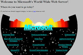
Remember the days when the internet was a wild, untamed frontier? The 90s were a time of experimentation and creativity in website design, characterized by bold colors, flashy animations, and quirky fonts.
One of the most iconic features of 90s website design was the heavy use of tiled backgrounds. Geometric patterns, stars, and other repeating motifs adorned countless websites, creating a visual cacophony that somehow felt just right for the era.
Let’s not forget about animated GIFs. These simple yet mesmerizing graphics were everywhere in the 90s, adding movement and whimsy to web pages. From spinning logos to dancing babies, animated GIFs were an essential part of any self-respecting website.
Font choice was another key element of 90s website design. Comic Sans and Papyrus reigned supreme, lending a playful and informal feel to many websites. Text was often displayed in bright colors or outlined for maximum impact.
And who could forget about visitor counters? Those little widgets proudly displayed at the bottom of the page, ticking away as visitors clicked through your site. It was a badge of honor to see that number climb higher and higher.
While modern web design has moved on from the excesses of the 90s, there’s something undeniably charming about looking back at those early days of the internet. The boldness, creativity, and sense of fun that defined 90s website design continue to inspire designers today.
So next time you’re feeling nostalgic for a simpler time online, take a trip down memory lane and revisit some classic 90s websites. You might just find yourself smiling at the sheer audacity and creativity on display.
Exploring 90s Website Design: Key Elements, Aesthetic Choices, and Modern Evolution
- What are some common design elements used in 90s website design?
- How did the use of animated GIFs contribute to the aesthetic of 90s websites?
- What were popular font choices in 90s website design?
- Why were tiled backgrounds so prevalent in 90s website design?
- How has modern web design evolved from the style of 90s websites?
What are some common design elements used in 90s website design?
In 90s website design, several common design elements were prevalent and iconic. These included the use of tiled backgrounds featuring geometric patterns or stars, animated GIFs for adding movement and visual interest, quirky fonts like Comic Sans and Papyrus for a playful touch, and visitor counters proudly displayed at the bottom of web pages. Bold colors, flashy animations, and outlined text in bright hues were also typical features of 90s website design, creating a visually eclectic and nostalgic aesthetic that defined the era’s online presence.
How did the use of animated GIFs contribute to the aesthetic of 90s websites?
The use of animated GIFs played a significant role in shaping the aesthetic of 90s websites. These simple yet captivating graphics added a dynamic and interactive element to web pages, capturing the attention of visitors with their movement and visual appeal. From spinning logos to flashing text and whimsical animations, animated GIFs injected a sense of fun and playfulness into 90s website design. They were often used to highlight key information, create eye-catching banners, or simply add a touch of personality to the overall look and feel of a website. In essence, animated GIFs were not just decorative elements but integral components that contributed to the unique and eclectic charm of 90s web design.
What were popular font choices in 90s website design?
In the realm of 90s website design, popular font choices were characterized by a playful and eclectic mix that defined the era. Fonts like Comic Sans and Papyrus were ubiquitous, adding a whimsical touch to web pages. These fonts, with their casual and informal feel, were often used in bright colors or outlined for emphasis, contributing to the overall vibrant and dynamic aesthetic of 90s websites. Despite evolving trends in typography, the legacy of these iconic font choices continues to evoke nostalgia for the early days of web design.
Why were tiled backgrounds so prevalent in 90s website design?
Tiled backgrounds were prevalent in 90s website design for several reasons. Firstly, the internet was still in its early stages, and web design tools were limited compared to what we have today. Tiled backgrounds allowed designers to create visually interesting and dynamic websites without needing large image files that could slow down page loading times. Additionally, tiled backgrounds were a popular choice because they could seamlessly repeat across the screen, providing a cohesive and uniform look to the website layout. The geometric patterns and repeating motifs of tiled backgrounds also added a sense of texture and depth to the design, making websites more visually engaging during a time when creativity and experimentation were highly valued in web design.
How has modern web design evolved from the style of 90s websites?
Modern web design has come a long way from the bold and quirky style of 90s websites. While the 90s were characterized by tiled backgrounds, animated GIFs, and colorful, playful fonts, modern web design tends to favor clean, minimalist layouts, responsive design for mobile devices, and high-quality images and videos. User experience is now a top priority, with an emphasis on intuitive navigation, fast load times, and accessibility. The use of CSS for styling and JavaScript for interactivity has allowed for more sophisticated and dynamic websites that engage users in a seamless and visually appealing way. Overall, modern web design has evolved to prioritize functionality, user-friendliness, and aesthetics in a way that reflects the changing technology and user expectations of the digital age.
