
Innovative Website Design: Pushing Boundaries and Captivating Users
In today’s digital age, where attention spans are shorter than ever, having a website that stands out from the crowd is crucial. Innovative website design has become a powerful tool for businesses and individuals alike to captivate users, convey their message effectively, and leave a lasting impression.
So, what exactly is innovative website design? It goes beyond just aesthetics and incorporates cutting-edge features, user-centric interfaces, and out-of-the-box thinking. It challenges traditional norms and pushes boundaries to create unique online experiences that engage visitors in new and exciting ways.
One aspect of innovative website design is the use of interactive elements. Gone are the days of static websites with limited user engagement. Today, designers are leveraging technologies like HTML5, CSS3, and JavaScript to create dynamic interfaces that respond to user actions. From scroll-triggered animations to parallax effects that add depth to the page, these interactive elements immerse users in an engaging journey through the website.
Another key element is responsive design. With the increasing use of mobile devices for browsing the web, websites must adapt seamlessly across different screen sizes. Innovative designers prioritize responsive design to ensure their creations look stunning on any device – be it a smartphone, tablet, or desktop computer. This adaptability not only enhances user experience but also boosts search engine rankings as search algorithms favor mobile-friendly websites.
Furthermore, innovative website design focuses on intuitive navigation. Users should be able to effortlessly navigate through the site and find what they’re looking for without confusion or frustration. Designers achieve this by implementing clear menus, logical information architecture, and intuitive user interfaces that guide visitors along their desired path.
Innovative designers also understand the power of storytelling in web design. They leverage visual storytelling techniques by using compelling imagery or videos that evoke emotions and create a memorable experience for users. By telling a story through their website’s visuals and content, businesses can effectively communicate their brand message and leave a lasting impact on visitors.
Additionally, innovative website design embraces minimalism and simplicity. By decluttering the layout and focusing on essential elements, designers create clean and visually appealing websites that are easy to navigate. This approach not only enhances user experience but also improves website loading times, which is crucial for retaining impatient users.
Lastly, innovative website design takes accessibility into account. Designers strive to make their websites inclusive and accessible to all users, regardless of disabilities or impairments. They ensure proper color contrast for readability, provide alternative text for images, and optimize the site’s structure for screen readers. By prioritizing accessibility, designers create an inclusive online environment that caters to a wider audience.
In conclusion, innovative website design is a powerful tool that goes beyond aesthetics alone. It combines interactive elements, responsive design, intuitive navigation, visual storytelling, simplicity, and accessibility to create captivating online experiences. By embracing these innovative approaches, businesses and individuals can differentiate themselves in the digital landscape and leave a lasting impression on their users. So why settle for ordinary when you can push boundaries with innovative website design?
9 Tips for Creating Innovative Website Designs
- Keep it simple
- Utilize whitespace
- Use visuals
- Optimize for mobile devices
- Add interactive elements
- Incorporate animation
- Prioritize usability
- Stay up-to-date with trends
- Create custom fonts & colors
Keep it simple
Keep it Simple: The Power of Simplicity in Innovative Website Design
In the ever-evolving world of website design, where flashy animations and complex layouts seem to dominate, there is one timeless tip that never fails to make an impact: keep it simple. Embracing simplicity in innovative website design can be a game-changer, captivating users and delivering an exceptional user experience.
When we talk about simplicity in website design, it’s not about being plain or boring. It’s about distilling the essence of your message and presenting it in a clean and uncluttered manner. By eliminating unnecessary elements and focusing on what truly matters, you create a visually appealing and user-friendly website.
One of the key advantages of simplicity is its ability to enhance usability. When visitors arrive on your site, they want to find information quickly and effortlessly. A cluttered layout with too many distractions can confuse or overwhelm them, leading to frustration and abandonment. On the other hand, a simple design guides users intuitively through the content, making it easy for them to navigate and find what they need.
Simplicity also improves loading times. With attention spans dwindling by the second, users expect websites to load almost instantly. Bloated designs with excessive graphics or complex animations can significantly slow down loading speeds, resulting in higher bounce rates. By keeping your design simple and lightweight, you ensure that your website loads swiftly across different devices and connection speeds.
Moreover, simplicity has a profound impact on aesthetics. Clean lines, ample white space, and a well-organized layout create an elegant visual appeal that draws users’ attention to the most important elements on your site. It allows key messages to shine through without distraction while providing a sense of professionalism and sophistication.
Another advantage of simplicity is its compatibility with responsive design principles. As mobile browsing continues to dominate internet usage, ensuring that your website looks great on any screen size is crucial. Simple designs are easier to adapt and optimize for responsive layouts, allowing your site to seamlessly adjust to different devices without sacrificing functionality or aesthetics.
Lastly, simplicity fosters better user engagement. When users encounter a cluttered website, they may feel overwhelmed or unsure about where to focus their attention. In contrast, a simple design directs users’ attention to the most vital elements, such as calls-to-action or important content. By reducing distractions and guiding users along a clear path, you can increase their engagement and encourage desired actions.
In conclusion, simplicity is a powerful principle in innovative website design. By embracing simplicity, you create user-friendly experiences that are visually appealing, easy to navigate, and compatible with various devices. Simplicity enhances usability, improves loading times, elevates aesthetics, supports responsive design, and fosters better user engagement. So remember: when it comes to website design, keeping it simple can have a profound impact on your success.
Utilize whitespace
Utilize Whitespace: The Art of Simplicity in Innovative Website Design
In the realm of innovative website design, one tip stands out as a fundamental principle: utilizing whitespace. Whitespace, often referred to as negative space, is the empty or blank area between elements on a web page. While it may seem counterintuitive to leave parts of a website blank, whitespace plays a crucial role in creating visually appealing and user-friendly designs.
Whitespace provides breathing room for content and design elements, allowing them to stand out and grab users’ attention. It helps organize information and guide users’ focus by separating different sections or elements on a page. By strategically incorporating whitespace, designers can create a sense of balance and harmony that enhances the overall aesthetic appeal of the website.
One common misconception is that whitespace must be completely white. In reality, it can be any color or even patterned. The key is to ensure that it complements the overall design and doesn’t distract from the content itself. Whitespace can be used effectively in various areas of a website, including margins, between paragraphs or images, around buttons or forms, and even as background space.
The power of utilizing whitespace lies in its ability to improve readability and comprehension. By giving text and other visual elements room to breathe, designers make it easier for users to absorb information quickly. Clear separation between different sections minimizes cognitive load and allows users to navigate through the website effortlessly.
Whitespace also contributes to an enhanced user experience by reducing visual clutter. In today’s fast-paced digital world, where users have limited time and attention spans, simplicity is key. By employing ample whitespace, designers create clean and uncluttered interfaces that are visually appealing and easy to understand. This simplicity fosters a sense of trust in users while providing them with an enjoyable browsing experience.
Moreover, whitespace can enhance responsive design by making websites more adaptable across different screen sizes and devices. When designing for mobile, for example, utilizing whitespace ensures that content remains legible and accessible, even on smaller screens. It allows for a seamless user experience, regardless of the device being used.
Innovative website designers understand that whitespace is not wasted space but rather an essential design element. It serves a purpose in improving aesthetics, readability, and user experience. By embracing whitespace and incorporating it thoughtfully into their designs, designers can create visually stunning websites that are engaging, intuitive to navigate, and leave a lasting impression on users.
In conclusion, the strategic use of whitespace is a powerful technique in innovative website design. It enhances visual appeal, improves readability, simplifies navigation, and contributes to an overall positive user experience. By embracing the art of simplicity through whitespace utilization, designers can create websites that truly stand out in today’s crowded digital landscape.
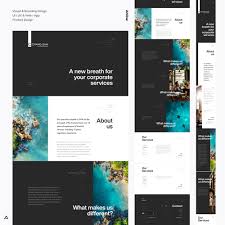
Use visuals
Use Visuals: Enhancing User Experience and Making a Lasting Impression
When it comes to innovative website design, one tip that stands out is the use of visuals. Incorporating high-quality images, videos, and graphics into your website can greatly enhance user experience, convey your brand message effectively, and leave a lasting impression on visitors.
Visuals have a powerful impact on human perception and engagement. Studies have shown that people are highly responsive to visual stimuli, with visuals being processed faster and retained longer than text alone. By strategically using visuals on your website, you can capture users’ attention, evoke emotions, and create a memorable experience.
One way to leverage visuals is through stunning imagery. High-resolution photographs or illustrations related to your content can instantly grab users’ attention and make them want to explore further. Whether it’s showcasing your products or telling a story through visuals, compelling imagery helps create an emotional connection with your audience.
Videos are another effective visual tool in innovative website design. They allow you to deliver information in an engaging and dynamic manner. Whether it’s a product demonstration, an animated explainer video, or a behind-the-scenes look at your business, videos can captivate users and convey complex messages more effectively than text alone.
Infographics are also gaining popularity as they present information in a visually appealing and digestible format. By using graphics, charts, and icons to represent data or concepts, you can simplify complex information and make it easier for users to understand at a glance.
Furthermore, consider incorporating interactive visuals into your website design. This could include interactive sliders or carousels that allow users to explore different images or interactive maps that provide an immersive experience. These interactive elements not only engage users but also encourage them to spend more time on your site.
It’s important to note that while visuals play a significant role in innovative website design, they should be used thoughtfully and purposefully. Avoid overwhelming the page with excessive visuals that may distract or confuse users. Instead, focus on using visuals that align with your brand identity and enhance the overall user experience.
In conclusion, incorporating visuals into your website design is a powerful way to enhance user experience and make a lasting impression. Whether it’s through stunning imagery, engaging videos, informative infographics, or interactive elements, visuals can captivate users, convey your brand message effectively, and create a memorable online experience. So, embrace the power of visuals in your innovative website design and watch as it takes your website to new heights.
Optimize for mobile devices
Optimize for Mobile Devices: The Key to Reaching a Wider Audience
In the fast-paced digital world we live in, optimizing your website for mobile devices has become a non-negotiable aspect of innovative website design. With the majority of internet users accessing websites through their smartphones and tablets, neglecting mobile optimization is like turning away potential visitors and customers.
So, what does it mean to optimize your website for mobile devices? It involves designing and developing your site in a way that ensures it looks and functions seamlessly across various screen sizes, providing users with an exceptional browsing experience regardless of the device they use.
One crucial aspect of mobile optimization is responsive design. Responsive websites automatically adjust their layout, images, and content to fit the screen they are viewed on. This means that whether someone visits your site on their smartphone, tablet, or desktop computer, they will have a consistent and user-friendly experience. Responsive design eliminates the need for separate mobile versions of your website, saving time and resources while delivering a cohesive brand experience.
Optimizing for mobile devices also entails considering the limitations of smaller screens. Designers must prioritize simplicity and clarity in their layouts. Streamlined navigation menus, concise content, and easily tappable buttons are essential elements that ensure users can navigate effortlessly on their touchscreens. By simplifying the user interface, you make it easier for visitors to find what they need quickly.
Page loading speed is another critical factor when optimizing for mobile devices. Mobile users expect fast-loading websites; otherwise, they are likely to abandon them within seconds. To improve loading times, designers must optimize images by compressing them without sacrificing quality and minimize unnecessary scripts or plugins that could slow down the site’s performance.
Furthermore, optimizing for mobile means paying attention to touch-friendly interactions. Unlike using a mouse pointer on desktop computers, mobile users rely on finger gestures like swiping and tapping to interact with websites. Designers should ensure that buttons and links are appropriately sized and spaced to avoid accidental clicks and frustration.
The benefits of mobile optimization are numerous. Firstly, it allows you to reach a wider audience, as more people now access the internet primarily through their mobile devices. By providing a seamless experience on smartphones and tablets, you can engage potential customers who prefer browsing on-the-go.
Secondly, mobile optimization positively impacts your search engine rankings. Search engines like Google prioritize mobile-friendly websites in their results, making it easier for users to find your site. By meeting their requirements for mobile usability, you increase your chances of appearing higher in search results and attracting organic traffic.
In conclusion, optimizing your website for mobile devices is an essential tip for innovative website design. It ensures that your site delivers a consistent and user-friendly experience across different screen sizes. By embracing responsive design, simplifying navigation, optimizing loading speed, and considering touch interactions, you can reach a wider audience and improve your search engine visibility. Don’t miss out on the opportunity to engage with the growing number of mobile users – optimize your website for mobile devices today!
Add interactive elements
Enhancing User Experience: The Power of Interactive Elements in Website Design
In the ever-evolving world of website design, finding ways to captivate and engage users is paramount. One effective strategy that has gained significant traction is the inclusion of interactive elements. By adding interactive features to your website, you can create a dynamic and immersive experience that keeps visitors coming back for more.
Interactive elements refer to any components on a website that respond or react to user actions. These can range from simple hover effects and buttons to more complex animations, sliders, quizzes, or even games. The goal is to provide users with an active role in their browsing experience, encouraging them to explore and interact with your content.
One of the key benefits of incorporating interactive elements is the ability to grab users’ attention and make a lasting impression. When visitors encounter an engaging element that responds to their actions, it creates a sense of intrigue and curiosity. This can lead them to spend more time on your website, increasing the chances of conversion or achieving your desired goals.
Moreover, interactive elements have the potential to enhance user engagement and encourage interaction with your brand. By offering unique experiences through interactive features, you create a memorable connection with your audience. For example, implementing a live chatbot can provide instant assistance and personalized recommendations while fostering a sense of interactivity.
Another advantage is that interactive elements can effectively convey information or tell a story in an engaging way. Instead of presenting static content, you can use animations or interactive infographics to present complex ideas or data in a more digestible format. This not only makes information easier for users to understand but also adds an element of fun and interactivity.
Furthermore, incorporating interactive elements can improve navigation and user flow on your website. By providing clear visual cues or using scroll-triggered animations, you guide users through different sections seamlessly. This helps prevent confusion and ensures visitors find what they’re looking for effortlessly.
When implementing interactive elements, it’s important to strike a balance between functionality and usability. While these features can enhance user experience, it’s crucial to avoid overwhelming users with excessive or unnecessary interactions. The key is to find the right mix of interactivity that aligns with your brand and supports your website’s objectives.
In conclusion, adding interactive elements to your website design can significantly enhance user experience and engagement. By incorporating features that respond to user actions, you create a dynamic and immersive environment that captivates visitors. Whether it’s through animations, quizzes, or interactive infographics, these elements have the power to leave a lasting impression on your audience while fostering a deeper connection with your brand. So why not leverage the power of interactivity and take your website design to new heights?
Incorporate animation
Incorporate Animation: Bringing Websites to Life
When it comes to innovative website design, one tip that stands out is the incorporation of animation. Animation has the power to bring websites to life, capturing users’ attention and creating a dynamic and engaging experience.
Gone are the days of static web pages. With advancements in technology and design tools, designers now have the ability to add subtle or bold animations that enhance user interaction and make websites more memorable.
One way animation can be used is to guide users’ attention. By strategically animating elements on the page, designers can direct users’ focus towards important information or calls-to-action. Subtle movements like fading in or sliding elements into view can help draw attention without being overly distracting.
Animation can also be employed to provide visual feedback and improve user experience. When users interact with buttons or forms, animations can provide instant feedback by responding to their actions. For example, a button changing color or an input field expanding when clicked gives users a sense of interactivity and responsiveness.
Moreover, animation can be used to tell stories and convey complex ideas in a visually appealing manner. By using animated sequences or transitions, designers can break down information into digestible chunks, making it easier for users to understand and retain key messages. This storytelling approach not only engages users but also helps them connect with the brand or product being presented.
Another way animation adds value is by creating delightful microinteractions throughout the website. Microinteractions are small animations that occur in response to specific user actions, such as hovering over a button or scrolling through content. These subtle animations add an element of surprise and delight, making the overall user experience more enjoyable.
However, it’s important for designers to strike a balance when incorporating animation. While animation can enhance a website’s visual appeal and engagement factor, excessive use of complex animations may lead to longer loading times or distract users from the main content. It’s crucial to consider the target audience, website goals, and overall user experience when deciding which animations to include.
In conclusion, incorporating animation into website design is a powerful way to enhance user engagement and create memorable experiences. Whether it’s guiding attention, providing visual feedback, storytelling, or adding delightful microinteractions, animation brings websites to life. By carefully considering the purpose and impact of each animation, designers can strike the perfect balance between aesthetics and functionality. So why settle for a static website when you can captivate users with dynamic animations?
Prioritize usability
Prioritize Usability: Enhancing User Experience through Innovative Website Design
In the world of website design, aesthetics and visual appeal often take the spotlight. However, one tip that should never be overlooked is the importance of prioritizing usability. An innovative website design that focuses on usability can greatly enhance the user experience, leading to higher engagement, increased conversions, and overall customer satisfaction.
Usability refers to how easily users can navigate and interact with a website. It encompasses factors such as intuitive navigation, clear content structure, fast loading times, and responsive design. When these elements are thoughtfully incorporated into a website’s design, users can effortlessly find what they need and accomplish their goals without frustration or confusion.
One way to prioritize usability is through intuitive navigation. Users should be able to navigate through your website seamlessly, with clear menus and logical information architecture. By organizing content in a way that makes sense to your target audience, you help them find what they’re looking for quickly and efficiently.
Another aspect of usability is ensuring fast loading times. In today’s fast-paced digital world, users have little patience for slow-loading websites. Optimizing your site’s performance by compressing images, minimizing code, and leveraging caching techniques can significantly improve loading times. This not only enhances user experience but also positively impacts search engine rankings.
Responsive design is another crucial element of usability in innovative website design. With the increasing use of mobile devices for browsing the web, it’s essential to ensure that your website looks and functions flawlessly across different screen sizes. Responsive design allows your site to adapt seamlessly to various devices, providing a consistent user experience regardless of whether someone is accessing it from a smartphone or desktop computer.
Additionally, content readability plays a vital role in usability. Use legible fonts with appropriate sizes and contrast ratios to ensure that users can read your content comfortably across different devices. Break up text into digestible chunks with headings and subheadings to make it scannable and easy to navigate.
Usability also involves incorporating user feedback into the design process. Conducting user testing, gathering feedback, and analyzing user behavior can help identify pain points and areas for improvement. By listening to your users’ needs and preferences, you can refine your website’s design to better serve them.
Prioritizing usability in innovative website design is not just about making things easier for users; it’s about creating a positive and memorable experience that keeps them coming back. By focusing on intuitive navigation, fast loading times, responsive design, content readability, and incorporating user feedback, you can ensure that your website is user-friendly and delivers an exceptional experience.
In a digital landscape where competition is fierce, standing out with an innovative website design that prioritizes usability can make all the difference. So, remember to put yourself in your users’ shoes and create a website that not only looks great but also provides a seamless and enjoyable experience for every visitor.
Stay up-to-date with trends
Staying Up-to-Date with Trends: A Key to Innovative Website Design
In the rapidly evolving world of website design, keeping up with the latest trends is essential to stay ahead of the curve and create innovative online experiences. By staying up-to-date, designers can harness new technologies, user expectations, and design aesthetics to push boundaries and captivate users.
One significant benefit of staying current with trends is the ability to leverage emerging technologies. The digital landscape constantly introduces new tools, frameworks, and coding languages that can enhance website functionality and user engagement. By staying informed, designers can incorporate these innovations into their projects, creating websites that are at the forefront of technology.
Moreover, monitoring trends allows designers to understand evolving user expectations. User behavior and preferences change over time, influenced by factors such as evolving design aesthetics and shifts in digital consumption patterns. By keeping a finger on the pulse of these changes, designers can adapt their strategies to meet user needs effectively.
Staying up-to-date with trends also enables designers to avoid outdated or obsolete design practices. What was considered cutting-edge a few years ago may now appear dated or cliché. By staying informed about current design trends, designers can ensure their work remains fresh and relevant in today’s fast-paced digital environment.
Furthermore, being aware of industry trends fosters inspiration and creativity. Exploring what other designers are doing sparks new ideas and encourages innovative thinking. It allows for the discovery of unique approaches that can set a website apart from its competitors.
However, it’s important to note that blindly following trends without careful consideration may lead to generic or superficial designs. Trends should be seen as sources of inspiration rather than strict rules. Designers must balance incorporating trendy elements while maintaining a unique identity for each project.
To stay up-to-date with trends in website design:
- Engage in continuous learning: Attend industry conferences or webinars, read design blogs or books, and participate in online communities where designers share insights and discuss emerging trends.
- Follow design influencers: Identify influential designers and design agencies in the industry and follow their work on social media platforms or subscribe to their newsletters. Their expertise and exposure to new trends can provide valuable insights.
- Experiment and explore: Set aside time for experimentation, allowing room for creativity and trying out new techniques or design concepts. This hands-on approach can lead to fresh ideas and innovative solutions.
- Collaborate with peers: Engage in conversations with other designers, both within your organization and in the broader design community. Sharing knowledge, exchanging ideas, and seeking feedback can help identify emerging trends and refine design approaches.
In conclusion, staying up-to-date with trends is a crucial aspect of innovative website design. By embracing emerging technologies, understanding user expectations, avoiding outdated practices, fostering inspiration, and maintaining a unique identity, designers can create websites that stand out in today’s competitive digital landscape. So keep an eye on the latest trends – they may just be the key to unlocking your next groundbreaking website design project!
Create custom fonts & colors
Create Custom Fonts & Colors: Elevate Your Website’s Personality and Brand Identity
When it comes to innovative website design, one tip that can truly make a difference is creating custom fonts and colors. By customizing these elements, you can elevate your website’s personality and establish a strong brand identity that sets you apart from the competition.
Fonts play a significant role in how your website looks and feels. They have the power to evoke emotions, convey messages, and create a distinct visual identity. While there are countless pre-designed fonts available, opting for custom fonts allows you to tailor the typography specifically to your brand’s personality and style.
Custom fonts enable you to add uniqueness and originality to your website. Whether you’re aiming for a bold and modern look or a more elegant and sophisticated feel, having a font that aligns with your brand’s voice enhances the overall user experience. It creates consistency across different touchpoints, such as your logo, headers, body text, and call-to-action buttons.
In addition to fonts, custom colors are equally important in defining your brand’s visual identity. Colors have psychological associations that can influence how users perceive your website and brand. By selecting custom colors that reflect your brand values or resonate with your target audience, you can evoke specific emotions or create an atmosphere that aligns with your message.
Custom colors also help establish recognition in users’ minds. When visitors consistently associate certain colors with your brand, they develop a stronger connection over time. This recognition becomes particularly valuable when users encounter other touchpoints of your business beyond the website itself – such as social media profiles or offline marketing materials – as they will instantly recognize the consistency in branding.
Moreover, creating custom fonts and colors allows you to avoid using generic templates or stock options that might be used by multiple websites. By investing in unique typography and color palettes tailored specifically for your brand, you ensure that every aspect of your website reflects who you are as a business or individual.
Implementing custom fonts and colors might require the expertise of a professional designer or developer. However, the investment is well worth it as it contributes to a cohesive and memorable user experience. When visitors encounter a website with carefully crafted fonts and colors, they are more likely to perceive it as professional, trustworthy, and dedicated to delivering an exceptional online experience.
In conclusion, creating custom fonts and colors is a valuable tip in innovative website design. By tailoring these elements to your brand’s personality and style, you can elevate your website’s visual appeal, enhance user experience, and establish a strong brand identity that leaves a lasting impression on visitors. So don’t settle for generic options – invest in custom fonts and colors to truly stand out in the digital landscape.