
Responsive Web Design with CSS
In today’s digital age, having a responsive website is crucial for reaching a wider audience and providing an optimal user experience across various devices. Responsive web design ensures that your site looks great and functions well on desktops, laptops, tablets, and smartphones. One of the key technologies used to achieve responsiveness is Cascading Style Sheets (CSS).
CSS allows web developers to control the layout and appearance of their websites. When it comes to responsive design, CSS media queries play a significant role. Media queries enable developers to apply specific styles based on the characteristics of the device being used to view the website.
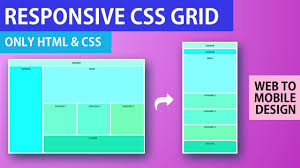
To create a responsive layout using CSS, developers typically start with a flexible grid system. This grid system allows content to adapt to different screen sizes by using relative units like percentages instead of fixed pixel values. By defining breakpoints in the CSS code using media queries, developers can adjust the layout at specific screen widths.
For example, a developer may set up media queries to change the number of columns in a grid or adjust font sizes when the screen width falls below a certain threshold. This approach ensures that content remains readable and visually appealing on all devices.
Another important aspect of responsive web design with CSS is fluid images. Instead of specifying fixed widths for images, developers can use CSS properties like max-width: 100% to ensure that images resize proportionally based on the width of their container. This prevents images from overflowing or becoming distorted on smaller screens.
In addition to layout and images, CSS can also be used to modify other aspects of a website’s design based on screen size. For example, developers can hide or show certain elements, change colors or fonts, or adjust spacing between elements to improve readability on different devices.
Overall, responsive web design with CSS is essential for creating modern websites that provide an optimal viewing experience across various devices. By utilizing CSS media queries and other techniques, developers can ensure that their sites are accessible and user-friendly no matter how visitors choose to access them.
5 Essential CSS Tips for Crafting Responsive Web Designs
- Use relative units like percentages for layout sizes to ensure scalability on different devices.
- Employ media queries to apply specific styles based on the device’s screen size and orientation.
- Optimize images for various screen resolutions to improve loading times on mobile devices.
- Utilize flexbox or grid layout systems for creating flexible and responsive designs.
- Test your website on multiple devices and browsers to ensure consistent responsiveness.
Use relative units like percentages for layout sizes to ensure scalability on different devices.
When implementing responsive web design with CSS, it is essential to utilize relative units such as percentages for defining layout sizes. By using percentages instead of fixed pixel values, developers can ensure that the layout scales proportionally across different screen sizes and devices. This approach allows content to adapt dynamically, maintaining a consistent and user-friendly experience regardless of the device being used. Embracing relative units like percentages in CSS empowers developers to create flexible and scalable layouts that enhance the responsiveness of their websites.
Employ media queries to apply specific styles based on the device’s screen size and orientation.
When implementing responsive web design with CSS, it is essential to utilize media queries to apply specific styles based on the device’s screen size and orientation. By incorporating media queries into the CSS code, developers can create a more tailored and optimized user experience for visitors accessing the website on different devices. This approach allows for targeted adjustments to layout, typography, and other design elements, ensuring that the site looks and functions seamlessly across a variety of screen sizes and orientations.
Optimize images for various screen resolutions to improve loading times on mobile devices.
Optimizing images for various screen resolutions is a crucial tip in responsive web design with CSS, especially when it comes to improving loading times on mobile devices. By serving appropriately sized images based on the device’s screen resolution, developers can ensure faster load times and a smoother user experience. Using CSS properties like max-width: 100% to make images fluid and implementing techniques such as lazy loading can help reduce the overall page weight and enhance performance on mobile devices with limited bandwidth. Prioritizing image optimization in responsive design not only improves loading times but also contributes to a more efficient and user-friendly website across all screen sizes.
Utilize flexbox or grid layout systems for creating flexible and responsive designs.
When implementing responsive web design with CSS, it is highly recommended to utilize flexbox or grid layout systems to create flexible and responsive designs. Flexbox and grid layouts offer powerful tools for structuring content and organizing elements on a webpage in a way that adapts seamlessly to different screen sizes. By leveraging these layout systems, web developers can easily create dynamic and visually appealing designs that automatically adjust to the available space on various devices, providing a consistent user experience across desktops, laptops, tablets, and smartphones.
Test your website on multiple devices and browsers to ensure consistent responsiveness.
To ensure consistent responsiveness in your website design, it is crucial to test it on multiple devices and browsers. By testing your site across various platforms, such as desktops, laptops, tablets, and smartphones, you can identify any issues or inconsistencies in the layout and functionality. Additionally, testing on different browsers ensures that your website displays correctly and functions properly for all users, regardless of their preferred browser. This thorough testing process helps to guarantee a seamless user experience and reinforces the effectiveness of your responsive web design CSS implementation.